
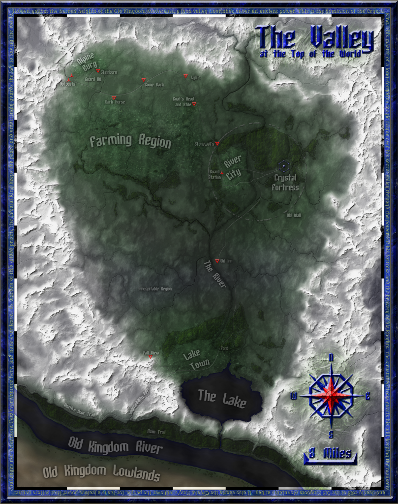
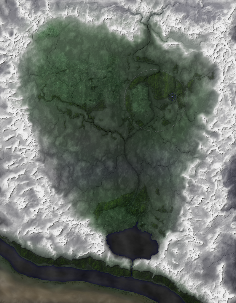
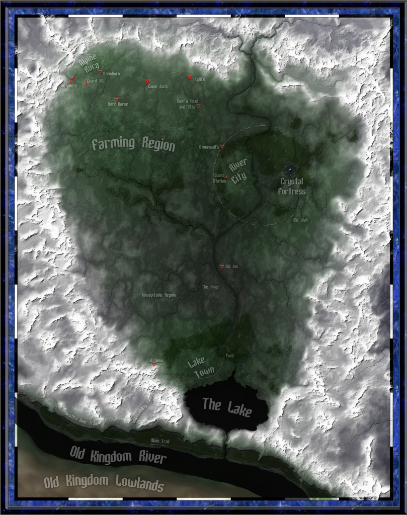
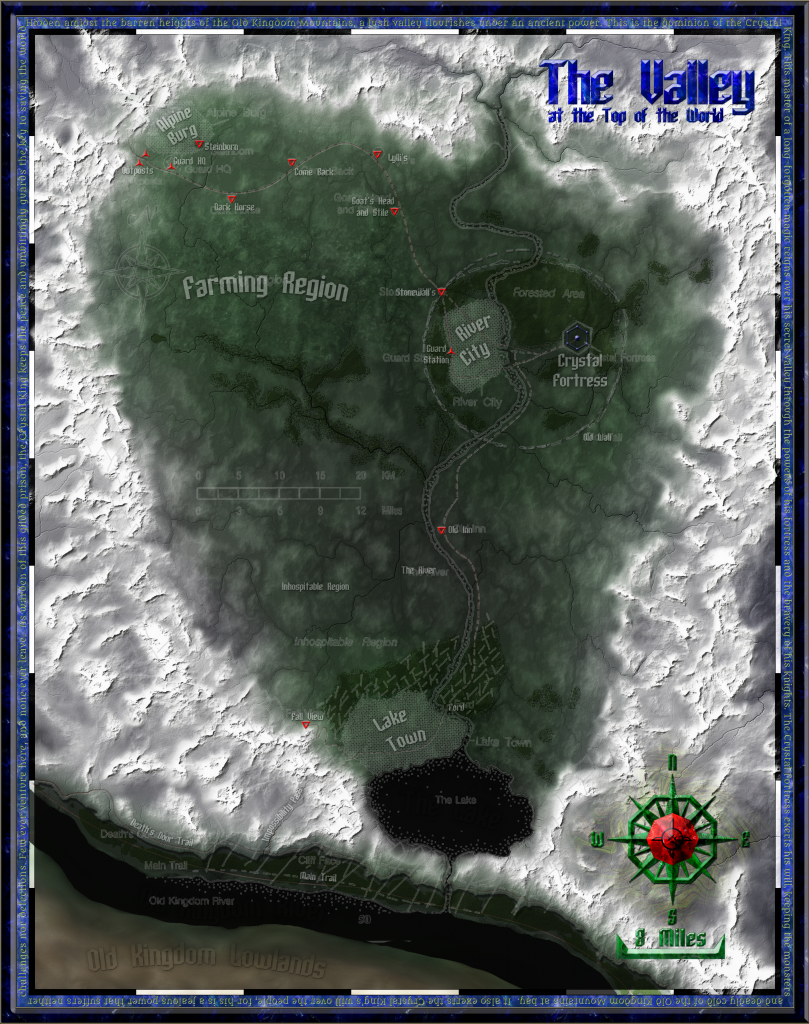
EDIT: The map is complete! Click here to see the full, final version.Click here to see a bare geography version.
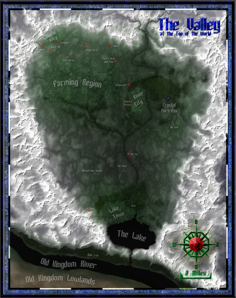
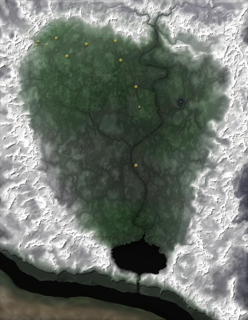
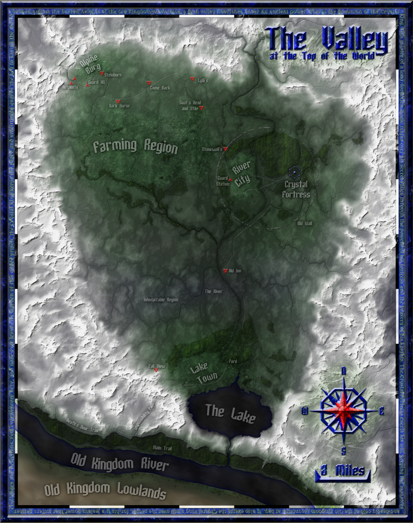
EDIT: (Previous edit) The rough draft of the map is finished.Although I've found plenty that needs fixing, I've been looking at this map for so long that it's easy to miss some pretty obvious errors. If you have the time, please look it over in detail and point out any errors or problems you see.
Zyanitevp, our coordinator of megaversal ambassadorship, game master of "A God... Rebuilt", and all-around Palladium super-fan, has commissioned me to make a map of the Valley at the Top of the World. The secret dominion of the Crystal King will be getting the full treatment.
Planned features:
+The map will be big enough to print on 8.5x11 inch paper at 300 dots per inch, which is about at photo-quality.
+The area portrayed will include the Valley and its immediate surroundings. The scale will be similar to that found on p50 of Island at the Edge of the World, but it'll include the mountains on all sides.
+Roads, towns, inns, and other places of interest will be marked. I plan on drawing the Crystal Fortress directly.
+The map will be fully colored/textured. I will attempt to show individual farms and woods.
I'll post in-progress shots here as I go.
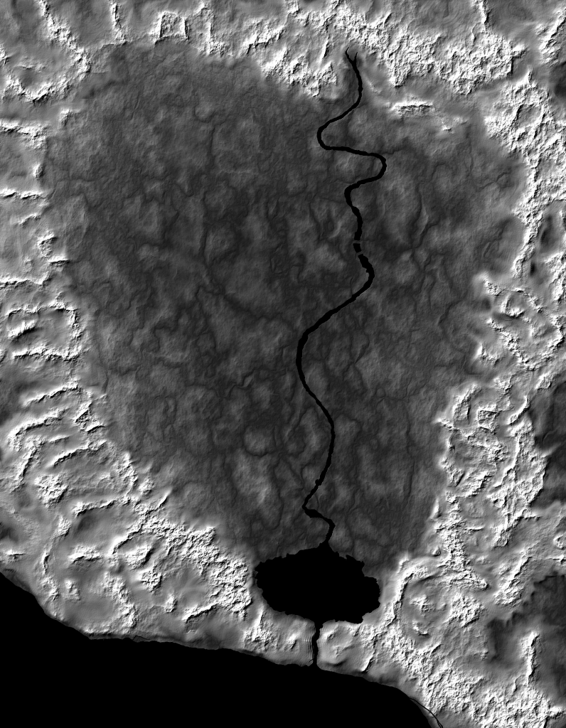
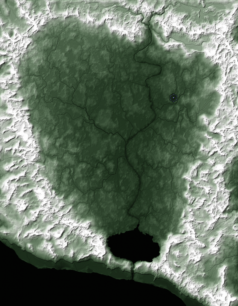
So far, I've researched the source maps and text, defined the scale and region to be mapped, and started working on the raw topography. Here's my initial draft of the land sculpt.I've done some airbrushing work to blend the mountains into the lowlands of the valley. There's plenty more to be done, including:
-I need to show a cliff face along the shore of the Old Kingdom River in the south. Cliffs are tricky to do from a top-down perspective, but I have some ideas.
-The surrounding mountains need some adjustment to make them look a bit more impassable.
-The Crystal Fortress is supposed to be in a depression. I need to draw this in, as well as the berm that surrounds it.
-The little river in the valley needs a lot of work. I drew it to match the page 50 map, but the detail map of River City depicts it as being much narrower than it appears on page 50. I'll also need to add in some tributaries.
-I plan on adding in a waterfall in the south where the little river runs over the cliff face.
Issues:
-The scaling of settlements in The Valley is really weird. All three towns take up huge amounts of space with relatively tiny populations.
-Several features are shown on the page 50 map, but are not described in the text: Impossibility Pass, Death's Door Trail, Main Trail, Fall View are the most-glaring.
-As noted above, the canon maps don't match up precisely. I'm using the most-zoomed-in-map-wins approach.


